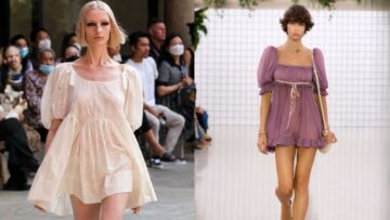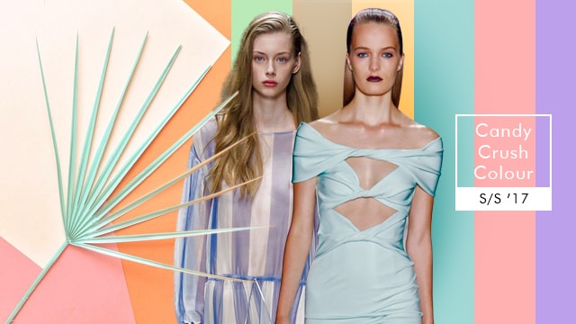
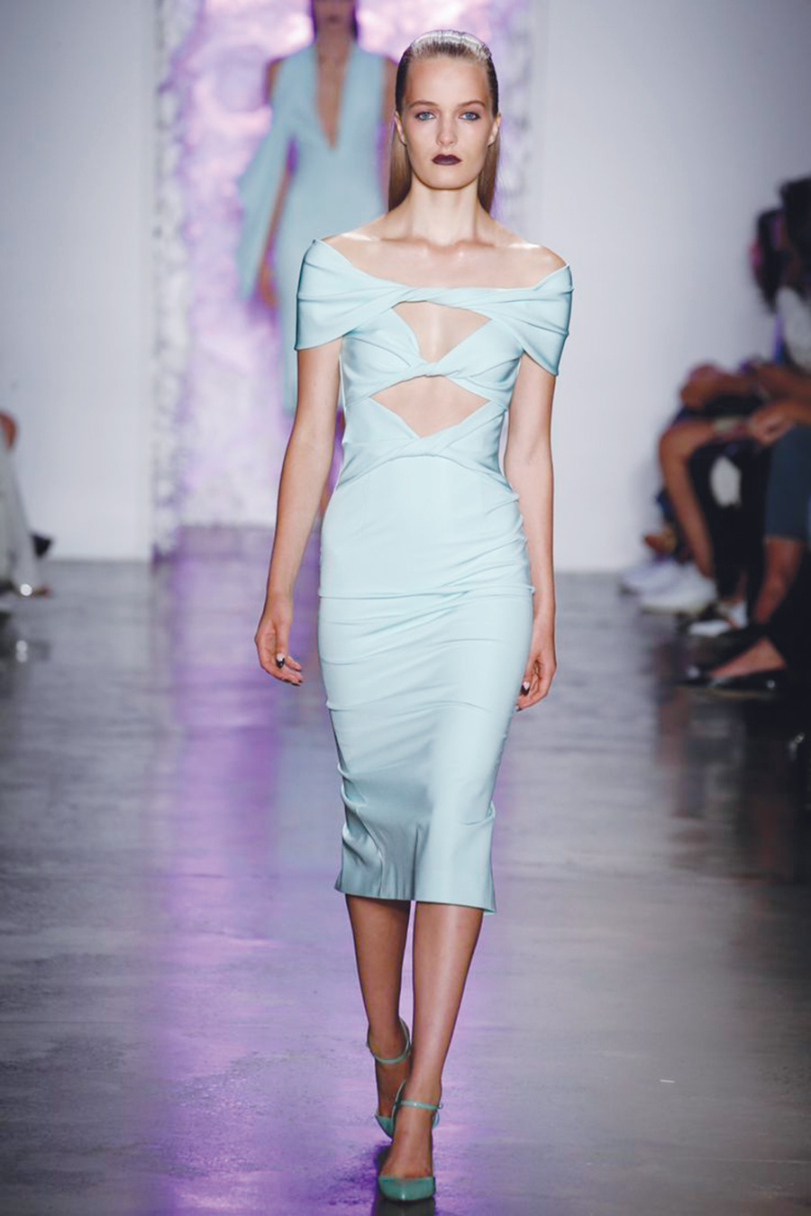
Pastel tones are undoubtedly the hottest colour trend of Spring/Summer 2017. Pink, lilac, light blue and mint green are just some of the colours that are able to make any clothing item or accessory more delicate. With summers swaying its way into the samplings of S/S ’17, designers and exporters have witnessed an influx of softer hues as a major colour input. Blush and many soft shades of ice pastels have entered the domain. Spotted all over the place and being seen in almost all the collections, pastels have the flexibility to look both sweet and sharp at the same time. With designers, exporters and street style bloggers talking continuously about this growing colour trend, we are soon to witness pastels taking over the retail spaces…
Collections are soon to say goodbye to those bold and bright hues, as the latest export samplings are dropping serious hints at pastels. When paired with neon accents and bold colours, soft pastels are fresh and trendy statements. Without a doubt, one of the best features of Versace in S/S ’16 was her array of smart suits in ice pink. Be it panelled dresses in ice blue and light peach at Bluemarine or gentle flowing garments in candy colours at Dolce & Gabbana, each design proved the capacity of the pastels to be soft and strong at the very same time. Drome worked on the military-inspired still date-worthy rompers, selected the perfect pink hue. Versace jackets and longer pieces for the sportier tomboy from the Brock collection and long, pleated, plunging neckline decorated Valentino dresses together gave a bigger picture about the candy floss-inspired look the collections worked upon.
Focusing on pastel hues, the S/S ’17 fashion trends gained grace; paving way for delicious blush pink, baby blue, mint green and lavender tones. The pastel shades have been trending since the Autumn/Winter 2014, the reason these shades have turned into classics. Mudit Gupta, Partner, Studio Kreative Gifts & Merchandise, discussing about candy shades shared, “These colours were mostly used in the intimate clothing segment to start off, but now has moved to the mainstream clothing as well. Pastels are infused with a whole new attitude this season, due to the sleeker yet roomy silhouettes being worked on for the summer months, and due to the soft play on nuances, responsible for expanding the palette even further.” Various shades of salmon pink, icy pink, powder pink, apricot, ivory, lemon yellow, vanilla, lemon chiffon, mint, tea green, lavender and alice blue are few of the many shades named by the exporters as the shades of the season.
As proven by the examples borrowed from the runway, the pastel hues intended for S/S ’17 are a take an opportunity to mix & match pretty pastels with other trending hues in building the most unexpected colour combinations. For instance, mixing baby blues (and other pastel hues) with earthy neutrals like camel, beige, sand and warm browns. Complementing any shade of pastel with light or dark grey, as this makes for an instant recipe for success and also, spicing up the delicate pastel clothing with a whisper of a totally contrasting shade; the powder pink meets forest green colour scheme at Thakoon makes for a brilliant example. Also, for more of an unexpected take on the trend, clashing pastels can be tried in an athletic-inspired outfit, opting for sporty dresses, cool sweatshirts, and minimalistic rain coats redefining the sports-luxe.
What is making the trend even bigger is the play of innovative surface application bringing out the subtle hues in creative inspirations. While the colour itself is finding popularity, when combined with a surface technique or soft romantic fabrics, the results are magical.
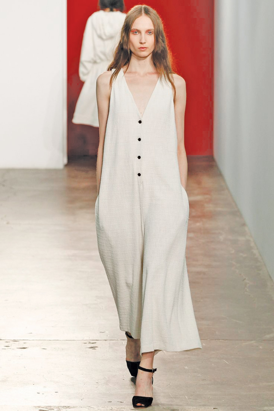
Soft Fabrics
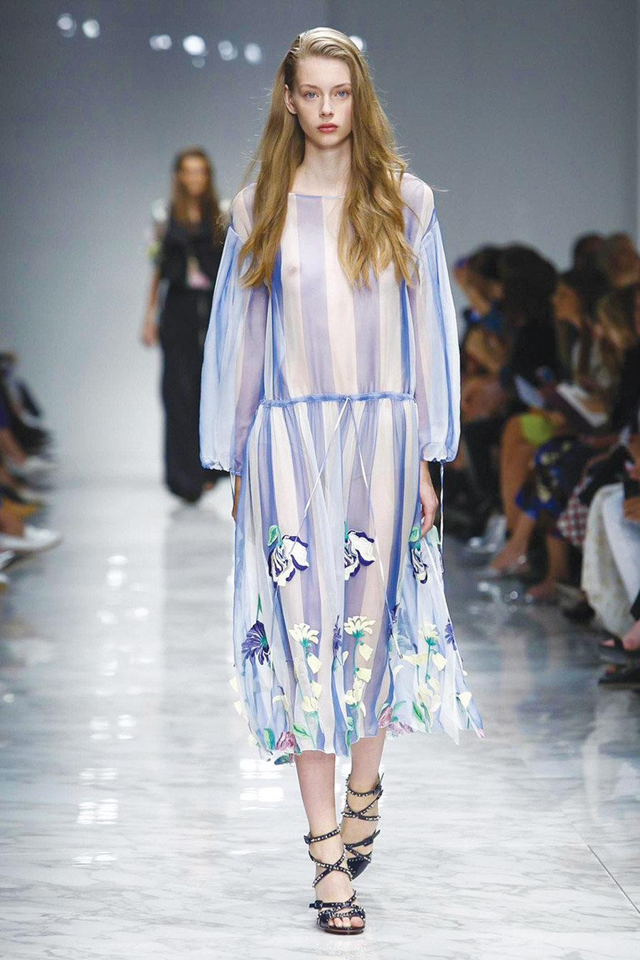
Summer, welcoming with its heat, also invites a range of fabrics which not only help stay cool but also look glamorous. With a bit of dainty elegance and a dash of playful charm – fabrics like tissue, chiffons, lurex nets and georgettes, bring to life the beauty and softness of the summer’s splendour. S/S ’17 fabrics taking inspirations from the sweet smell of rose gardens and delicate textures of fruity gelato depict the pastel power with dream-like vibrancy of colour in the happy and ecstatic warm summer days. Surfaces are sprinkled with sparkling reflections and soft prints on chiffon and net bases. Rajeev, Sr. Merchandiser & Designer, Colors India Pvt. Ltd. sharing his thoughts on the same said, “Pastels are soft yet dynamic hues that have the uncanny ability to evoke bold and vibrant looks at the same moment, as well. Then just as quickly it can be transformed into subtle and understated looks. The secret to the stylish flexibility of these colours is that they can be effectively worn alone, in small amounts, or used as a neutral hue with a wide range of other colours.”
Printed Pastels
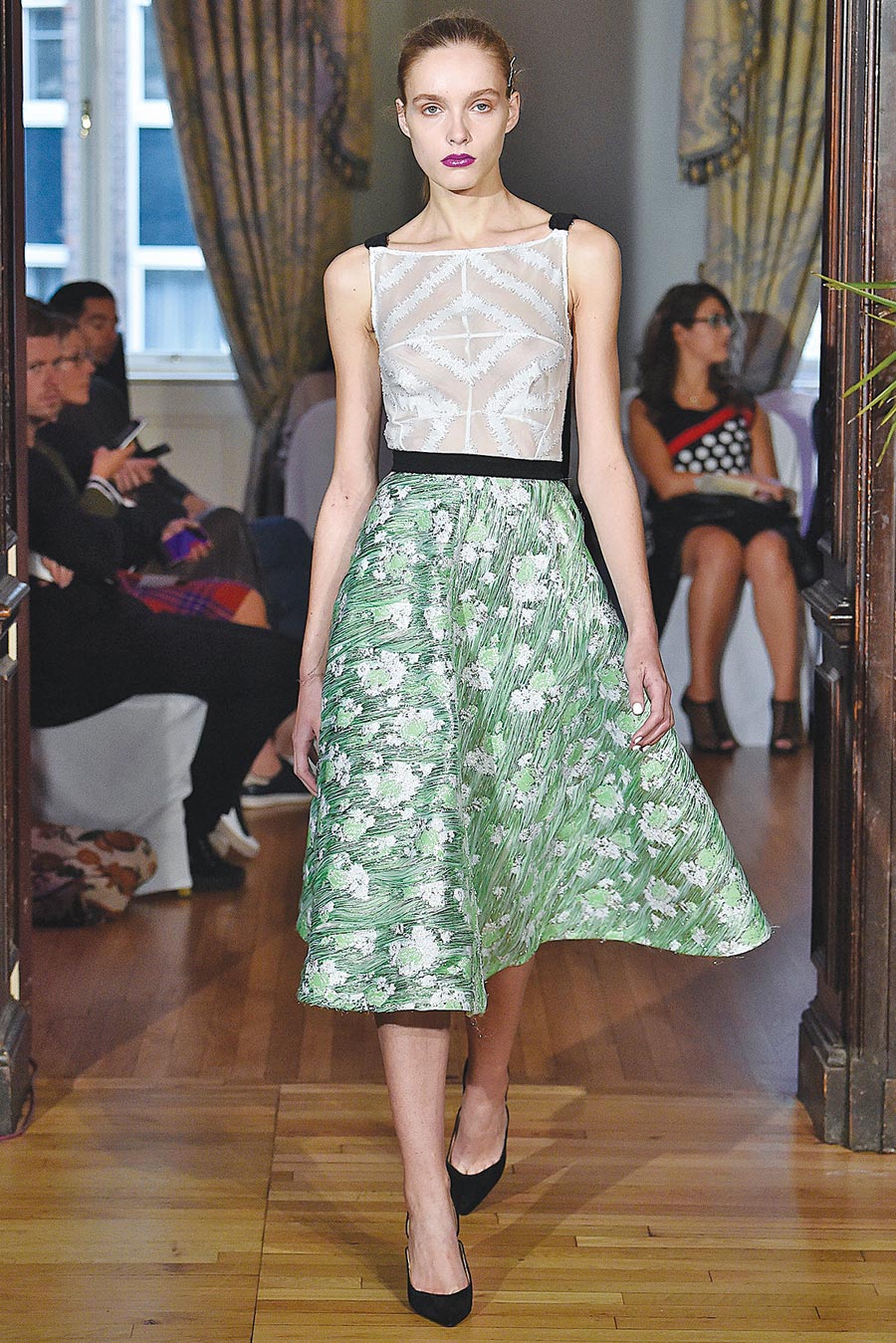
Signalling at yet another one of S/S ’17 novelties, the printed pastels make for a gorgeous update on what is already a pretty amazing trend. Making use of pastel hues with metallic textures to print on contracting backgrounds like on the skirts presented by Emilio de la Morena this season. Pastels look all chic and sophisticated, when done in abstract prints and velvet embroideries (much like the bird motifs at Rochas). The pastels also get richer in appearance when printed via foam printing. The foam adorns the motifs with a 3D contour which brings out the softness of the colours. “Foam print effect in pastel colours is very popular right now; puff and metallic prints combination are quite visible in kids clothing as well,” says Ajay Saini, Director, Bhamini Textile Printers.
Minimal Silhouetts VS. Heavy Embellishments
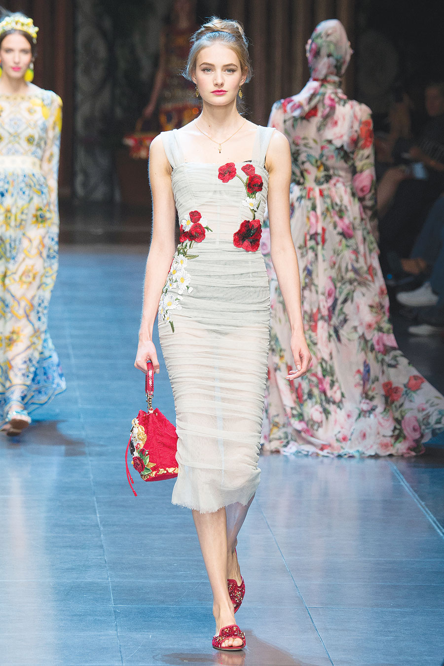
The pastel colours come hand-in-hand with the sleekest, simple and uncomplicated of silhouettes. Together they place a bet on minimalism, turning the quiet elegance into a complete statement. Away from the clean, sharp silhouettes, this season brought along plenty of pretty pastels garnished with heavy embellishments. The results are probably just as extraordinary looking as one would expect. Intricacy and sophistication come together when a pastel colour dyed fabric is decorated with very heavy sequin or beading work in the same colour palette. Dipin Oberoi, MD, Dipin Creations India, informing about their collection and pastel influences said, “The tone on tone effect, also known as the monochromatic colour combination comes out shining when done with pastels colours. Pastel coloured bases with pastel coloured embroidery is a big hit, where the embellishment is achieved along with the simple look.”