‘Home is where the heart is’…, this old saying in itself reflects the importance of home furnishing in creating an ambience that people can call a home. Like fashion, home décor is also an extension of a person’s personality. And though it is very individualistic…, there are many forecasters who help in finding the right touch when designing a home. For exporters working for the international home market, the ability to interpret what could sell in the coming season is the critical difference between getting orders and losing out to other companies/countries. Shifting through the many international directions floating in the market, Apparel Online has put together some of the key trends that home furnishing exporters should definitely incorporate in their collections for 2018.
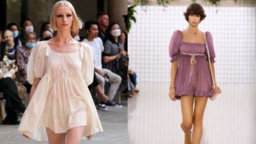
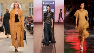
Fashion is being transferred to home faster than ever. As styles and trends hit the runway, it’s only a matter of time before they translate into home decor. Pillows, accessories, fabrics – it all shows up in as little as 3-6 months. Some of the hot trends that runways have been seeing that are finding way into the segment include floral prints, tassels and fringes, textures, eyelets, deconstructed look, patches and stars. As is the case of ethical fashion, forecasters predict that consumers will increasingly demand textiles and tableware products which reflect the nature and connections with communities. Yet, on the other side, a more colourful approach that references elements of technology and urbanization will continue to attract a section of the consumers.
According to WGSN, four key themes are likely to influence a consumer’s path to purchase home furnishing in 2018. The first of the four leading trends is “Slow Futures” – a calm, clean-looking, minimalist approach to life. The trend would be driven by a need to declutter complicated modern lives and to retreat in order to make sense of the information that flows around us. Consumers have been increasingly looking to the past to determine the future, which has created a “less-is-more” approach to their purchases.
The second trend is “Kinship” – soft indigo colours, rope, sea grass, nautical themes and sandy tones were being used as inspirations and, in combination with design influences from the Middle East and South America created texture, context and originality in fabrics. The third trend is called “Psychotropical” and is a “story about exploration” – about bright and exotic looks. The fourth and final concept is for “Younger Consumers”; it is about giving them the open space where they can actually be a part of the design process themselves, and then they can modulate the product based on their particular needs.
In the DIY fashion trend, Emojis are fast becoming a hot trend, popping up in decals, wallpaper and pillows. Patches are another big trend in DIY fashion, showing up in towels, linens, blankets and custom upholstery. Guitar straps – the top DIY fashion trend this season, is expected to quickly move into tie backs, pillow straps, trims and more.
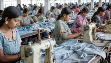
Indian exports following trends…
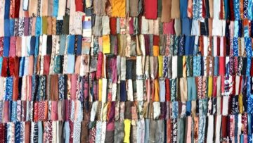
The good news is that most of the Indian exporters are clued in and many of them have focused attention on textured and natural fabrics and printed value additions. “If we talk about the trends in home furnishings products, then lot of printing with more and more demand for textures, in short, ‘nothing fancy is in fashion’ or basics have taken over the market. But on the same note, there is a lot of innovation going on with yarn blends like cotton modal, cotton bamboo and linen,” says Alok Aggarwal, ED, Shree Lakshmi Cotsyn. Corroborating his understanding of the trends, Tarandeep Singh – GM of Alps Industries, adds, “Textures that are natural but unique are in demand and we are working in that direction.”
A few companies specializing in eco-friendly products are also cashing in on the trend of being close to nature. “Our specialization is eco-friendly textiles, in India we have very less number of suppliers for the green and sustainable textiles, so it was an area that had huge potential to grow. Our product range starts with grass mats, bamboo mats, banana mats, and moves on to core products for kitchen linen and curtains,” shares K R Karuppanchetty, Executive Director, Skanthaguru Exports, Karur.
Colour trends follow overall demand for diversity…
Earlier this year, Pantone Colour Institute Executive Director Leatrice Eiseman shared colour and design trends for 2018 at the International Home + Housewares Show. Based on fashion runways, the art scene, television, movies, architecture, retail, theatre, food and consumer goods all over the world, Eiseman highlighted the fascination with letters and words as a design element, the use of triangles in both contemporary and retro themes, dimensional diamonds and intricacy, which is most likely to be spurred by the explosion of 3-D printing. Wood treatments and a throwback to the 1970s, fringe is “very hot and very strong.”
The eight colour groupings that the company believes will be strong in 2018 are:
Verdure – This palette features vegetal kinds of colours like celery and foliage being combined with berry-infused purples and an eggshell blue.
Resourceful – Complementary colours – oranges and blues – are combined in this palette that is clever and “resourceful” in re-using and re-furbishing what consumers may already own.
Playful –This palette is out-of-the ordinary and quirky. The colours are “bright-hearted more than light-hearted” with names to match, like minion yellow, lime popsicle, green flash and adventurous blue skydiver.
Discretion – Low-key and subtle, Discretion is the opposite of Playful. Nostalgic hues such as Elderberry, burnished lilac and hawthorne rose combine with strengthening tones to offer newness to a subtle palette.
Far-fetched – It refreshingly combines three popular rosy tones with iced coffee and ruby wine, as well as a few earthy tones such as cornsilk yellow.
Intricacy – This palette reflects the popularity of intricate designs. It features the “new neutrals,” aka metallic, but a florid Holly Berry Red and Yellow Sulphur adds a layer of drama.
Intensity – Coolly composed shades of plum, blue and blue-green quell the fires of orange ember glow, molten lava and bossa nova. Golds and black complete the palette.
TECH-nique – In a nod to the proliferation of technology, this palette features hues “that seem to shine from within.” Colours include a vibrant blue, green, fushia and purple, along with iridescent peacock tones in both turquoise and hot pink, which are offset by brilliant white and frosted almond.