If we equate garment industry to a sea beach, then the management principles are like waves that keep on embracing the industry, one after the other, affecting a few while others remain unfazed. After 5S, kaizen, 7-waste and six sigma, the new wave that is going to embrace the industry will be Yamazumi charts. Professor Prabir Jana from NIFT, Delhi writes why.
Yamazumi charts will become popular because lean is the flavour of the season and Yamazumi is part of lean manufacturing philosophy which categorize value added (VA) and non value added (NVA) work to explore improvement. In essence, Yamazumi charts are bright and colourful depictions of a manufacturing process. Not surprisingly, Yamazumi is another Japanese word and it is simply a stacked up bars each of which represents a business process and the time taken by each process is measured in minutes on the vertical axis.
Go round any modern car factory and you’ll find Yamazumi charts pinned up to encourage the workforce. It is a great visual tool to literally show where delays, wastage and blocks are happening in any manufacturing process. It has five key advantages:
It is visual. The workers can immediately and intuitively see where the delays are coming from.
It is simple. Clarity is power. Who needs a management consultant’s report, when a Yamazumi Board tells the story at a single glance.
It is inescapable. Hanging above the production line, the Yamazumi Board is a constant, perpetual inspiration to continuous improvement, or Kaizen.
It is public. The Yamazumi Board is in the open, glaringly so. With competitive work teams, this is a great motivator to positive performance improvement.
It highlights the key constraints. It shows the vital few opportunities that can change everything. Remember the Pareto Principle which illustrates 20% of all causes account for 80% of results. With a Yamazumi Board, one can see visually where the key constraints are. Magnify the power of the process by focusing on the “vital few”. This is also a key Six Sigma principle.
The Yamazumi chart can either be for a single product or multi product assembly line. A Yamazumi chart for a complete garment running in a PBU system reveals which operations are bottleneck and where to concentrate.
To make a Yamazumi chart for one style, we have to categorize the performance of an operator in line into three categories: value added, necessary non value added and non value added.
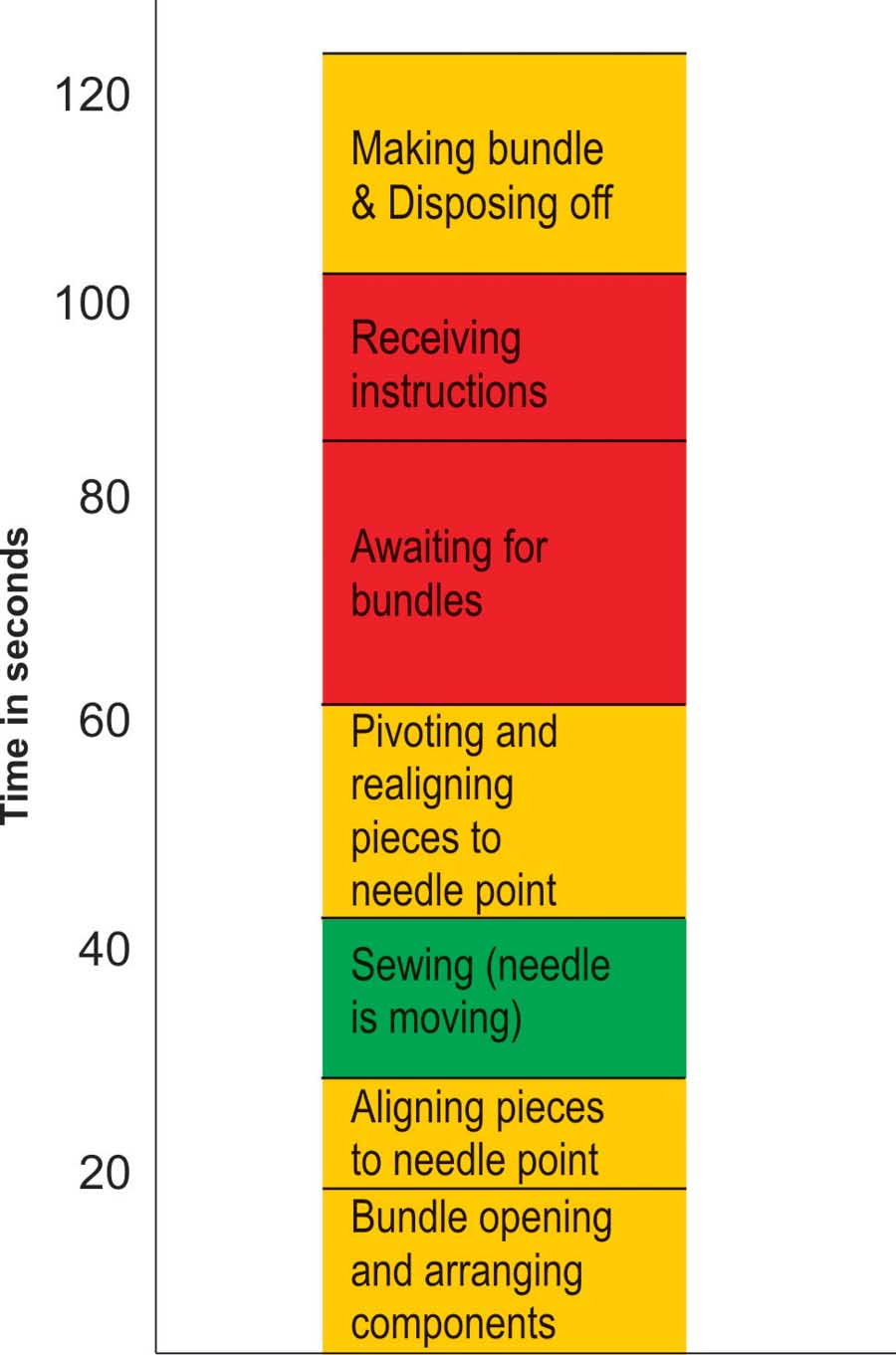
The steps that are necessary but do not “add value” (necessary non value added – NNVA) are in orange/yellow. The steps that make a real difference – the execution steps – steps that really add value (value added – VA) are coloured in green. The waste in the process, the failure mode, the unnecessary steps (non value added – NVA) are coloured red. Diagram 1 shows the breakdown of a sewing process, where needle movement is the value added step, while rests are either NVA or NNVA. These are the failures that must be eliminated through such lean production techniques as kaizen (continuous improvement) and poka-yoke (simple but effective) solutions.
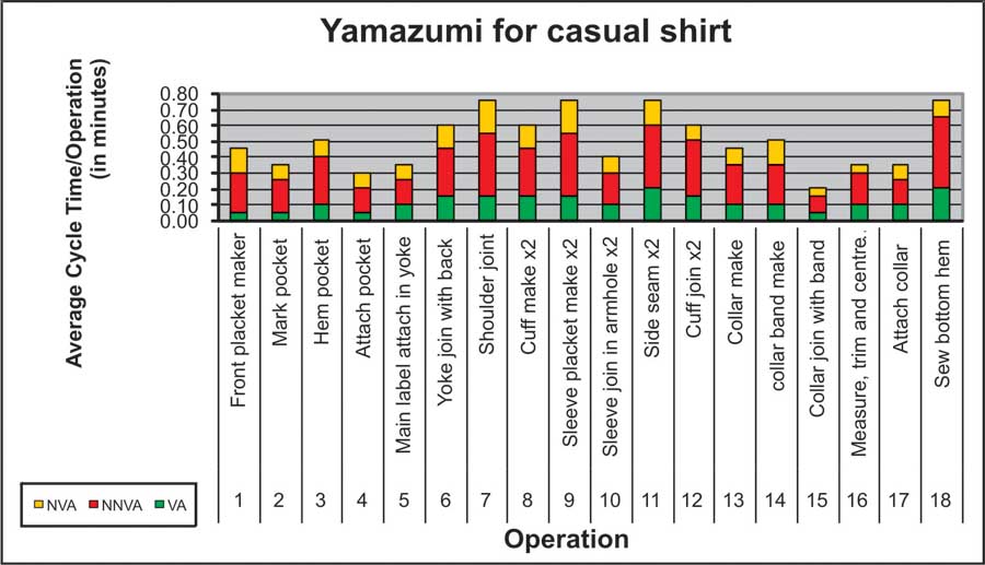
Taking an example of a casual shirt operations performed by sewing operator and their value addition rating, this categorization should start from simple macro level and then fine tuned to micro level (Diagram 2). Then the total SMV for each operation is split up into three parts: VA, NNVA and NVA.
The Yamazumi chart is a great visual tool to literally show where delays, wastage and blocks are happening in any manufacturing process with five key advantages – It is visual, It is simple, It is inescapable, It is public and It highlights the key constraints
The same power that the Yamazumi chart has to identify blockages and waste in a manufacturing process can be applied to work-life of everyone, say merchandisers, pattern makers, quality controllers, line supervisors and others, who all can make Yamazumi on their own on a spreadsheet and identify one’s own NA, NNVA and NVA. The simple test is to break the week into 7 columns of 8/10 hours. The aim isn’t to create work – so just give a one word summary (e.g. ‘Lunch’) and assign a colour to the chunk of time – in this case yellow. Fill in the Yamazumi grid, hour by hour. This may sound strange, but it will be an eye-opener, just as it was for the workers on the Toyota production line, revealing how little or fully engaged productive time delivers quite impressive results. The sheer time taken on non value added activities (talking, searching) and necessary non value added activities (cross-checking, inspection, transport) will be revealed. Then so much time will be a sea of red – the surfing, e-mailing, meandering phone conversations, the hours becoming days, the days into months, and the months into years…
Even the green activities may not be perfect. Every activity, however good, carries an opportunity cost. What could you have achieved in the time available? Unless some other work is making the best possible use of your time – something you can only define for yourself in reference to your organizations ultimate goals – well, it’s sub-optimal. The Yamazumi just reveals how much potential lies untapped.