The February edition of Premiere Vision welcomed a new look for the most anticipated fabric show of the season. The show was totally reinvented as a white city, with an entirely rethoughtout urban architecture by artists Eric Jourdan and Francesca Avossa, and the use of a unique material, DuPont™ Corian®. New stands were overlaid in white and transparency, emphasizing exhibitor’s collections: the explosion of colours, the subtlety of tones and the variation of materials. This new, modern, luminous and soothing environment was the perfect setting for a season that is set to be both dynamic and optimistic. Mpdclick brings you the very best of PV…
Afeeling of ‘bleisure’, mixing business with leisure was very apparent at the show, with increased refreshment and meeting areas, and many stands choosing to incorporate seating areas and a relaxed approach to previewing products. Visitors to each brand were able to browse at their leisure, whilst learning a little more before making that all-important purchase.
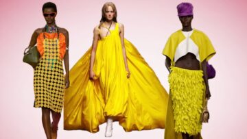
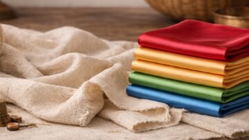
As with previous seasons, the show featured its four universes – Seduction, Distinction, Relax and Pulsation – where groundbreaking fabrics from exhibitors in that universe were displayed. The general forum was the place to go to discover the key themes for the spring/summer ’11 season: Cheeky Opulence, Regenerated Tailoring and Sparkling Nonchalance. Here we discovered a season that looks to be extremely dynamic, cultivating strong, bold contrasts, with relationships between fabrics and colour inversed and couture references juxtaposed with sportswear codes.
Additionally, the Latest New Forum showcased the exhibitors’ very latest creations, where natural and artificial blends were popular. Finally for those buyers interested in buying up-to-the-minute fabrics, the autumn/winter 10/11 Real-Time Trend forum was certainly the place to go!
Key trends of the show – Fabrics
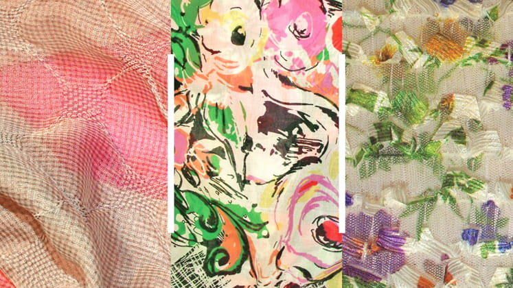
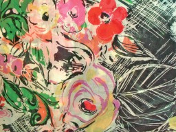
- Extravagant decoration sees itself in many guises from ornate embroideries to delicate tulles lavished with organza ruffles and hand-finished with painted country florals.
- A key denim look for spring/summer 11 is a classic blue wash that has been faded by sun and sea or hand-bleached, giving the appearance of fluid waves for a water themed look.
- Everything from cottons and linens to denim and suitings are treated to a washed out look, created through the use of natural yarns and fading techniques.
- Traditional checks are almost unrecognizable this season, with lightweight suitings and shirtings seen with pastel tones and soft gradient print effects.
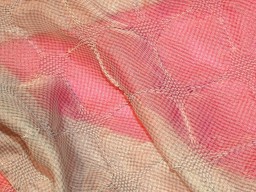
- Surface reflections are a key trend theme in terms of coatings, with subtle shimmer and wet look coatings seen on a variety of fabrics.
Key trends of the show – Prints
- Enlarged motifs take their inspiration from magnified mimicry, oversized butterfly wings and huge florals.
- An emerging aquatic theme sees itself through distinctive ripples and drowned floral prints.
- Brushstroke florals refuse to drop from the list as perennial favourite, this year updated with an optimistic colour palette.
- Shots of fuchsia appear in a variety of prints, making it the must have colour of the season.
- Sailor stripes are key with cotton and linen fabrics and will be one of the most profitable looks of the season.