Fresh from the runways of New York, London, Milan and Paris, we have collated four key colour palettes coming through for next winter as designers illustrate a luxurious intermingling of natural and urban tones that ride high on both positivity and personal well-being. Though each city has its own singular perspective of dealing with the global trend story, clearly the overall atmosphere of the season is gravitating towards warm comfort and is cosying up to a wave of neo-femininity that does not centre only on classical employment of colours but neither does it shy away from the same. So with this only-if-required approach in place, the colour shades that we will spot in spades in the coming months oscillate heavily between tawny autumnal maples, otter brown, lemony olives and marina blue while voraciously flirting with beauties like lilac purple, prim pinks and grenadine red.
As colours are possibly the most direct form of communicating the main inkling of the season, it is safe to ascertain that this time we are going back to basics and fashion’s main focus has shifted to delivering the calm tones of neutral colours bookended by blazingly warm hues set together in perfect harmony. The season offers a taste of humility and a sort of mind your own business ethnic in clean shades that are high in spirits.
Led by a vivid scarlet red, the colour palette for Fall/Winter 2017-18 enumerates on strong classical shades augmented by a spicy set of unpredictable colours for the season.
Optimististic In Love

As the state of the world appears to see-saw in wild extremes, fashion depicts the aspirational sunny optimism that everyone needs right now. The upbeat personality of this colour story is not limited to sunny buoyancy but it is also a call to action and ignition of the fire within each person. However, the tactful outlook is not in just fanning flames of rage but asserting the possibility of a sanguine and stable future. The immediacy of samurai reds demands for an uprising and fully participates in the fast-approaching revolution that is brewing in the society’s social fabrics.
The brightly warm spectrum of red, yellow and oranges is a symbol of breaking geographical boundaries and barriers of cultural differences coming together in a communized bond on kinship. The rise of a society that is brilliantly coloured in positivity. A beautiful sunrise overlooking at a season filled with notes of love, proses of passion and an inimitable strength in the vision of a united future.
Surrealist Games
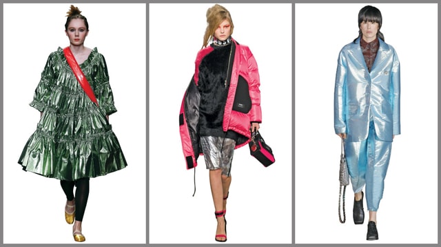
The roots of surrealism firmly stress on the innovative capacities of the human mind and all the seemingly endless juxtapositions it can offer. From psychedelics to cosmic discharges, the heavy dose of surrealist imagery is currently omnipresent in the creative world. This dreamy irrationality conjuring the idealistic potential of every individual is completely symbolic of our aspirations as a common society. The notion of a super-reality comes from this very surrealist movement and its current incarnation is in the tech-charged virtual reality and of course the sci-fi realm of video games.
The vibrant colour party that mixes fluorescent hues with illuminated metallic takes its direct references from the outpouring revolution in the world of simulated reality. As the boundaries between what is virtual versus and what is real get significantly blurred, hi-fructose colours that may not have been a natural choice in day-to-day life seem increasingly easy to administer in standard lifestyles. The fantastic absolution of these different worlds gives birth to colours like space-age silvers, electric pinks and fluorescent greens and blues.
Vineet Sood, S. D. Enterprises, substantiates this colour palette adding, “For our collections, this season is very big on bright and poppy colours like high saturation orange, green and electric pinks. We are also adding a bit of neon here and there as detailing, for examples, working on neon coloured fringes in pure white garments for high impact. Customers seem to really be buying into heavily charged colour palette this winter.”
Crème De La Crème

A leitmotif of letting go of all things superfluous as well as a sense of undressing your soul prevails throughout this theme. However, this disrobing of the self is immersed in a blanket of luxury since the overall cultural dominance of luxury is moving towards health and the realization of a well-adjusted mind, body and soul. A colour trend that is supremely polished perpendicularly because of its minimalistic nature and the aspirational disconnect it offers from overpowering adornments. Broiling through shades of basic browns and left in the calmness caramel nudes provide a sense of friendliness and comfort.
The upshot of an ongoing middle-of-the-road mood as well as the more diffident tone of the collections, creamy browns are on everyone’s mind. While the focus is on essentially getting naked and returning to our bare-boned roots, the trend often flirts with soft accents of dahlia purple or powdery blues.
The Midnight Sea
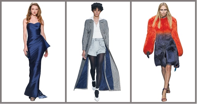
A tell-tale of mysterious night skies that have been the sole inspiration for many night owls and the moon children of the world, this colour story stands as your guide on sailing against the great dark deep blue waters. A soaring story of rebellion through the midnight sky and becoming the grey clouds of society that thrive to reach the forefront are the underlying moods this season. The many moods of the wild sea are refreshing our perspective in looking at a broader range of blues escalating from the coolest of cool icy blues to the depths of dark storm-ridden navy hues.
Apart from the obvious feeling of a quiet serenity that the monochromatic blue offers, its complementary setting with sharkskin greys harvest a sense of aloof thoughtfulness. Counteracting the intensity of these neutral and well-grounded colours are shades of burnt orange and arctic greens, all translating into fluctuating sentiments of elegant sophistication with confounding troves of treasure.
Payal Sadia, IVK Exports, confirms the trend saying, “The season is definitely dominated by shades of blue, especially deep navies as the base with a small tinge of bright reds, orange and happy yellows as a value addition. Sometimes the addition can be as small as a strip of neon that totals to just two per cent of the entire garment but it is a very crucial element. These accent colours are the trendiest elements of the season, while the colour grey continues to grow as I believe, it has for the past few years.”




 Bharat Tex Special Report 2026