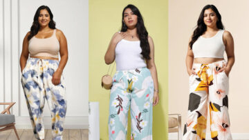
Pantone announced two colors of the year for 2016. Pantone 13-1520 TCX (Dubbed Rose Quartz) and Pantone 14-3919-TCX (Serenity), they are shades pastel pink and blue.
“Globally, we are experiencing gender blur as it relates to fashion, which has in turn impacted colour trends throughout all other areas of design. This more unilateral approach to colour is coinciding with societal movements toward gender equality and fluidity, the consumers’ increased comfort with using colour as a form of expression, and an open exchange of digital information has opened our eyes to different approaches to colour usage that challenge traditional colour associations.” says Pantone in a statement.
Also read – 2015 Pantone color of the year – Marsala
“Rose quartz is not baby pink. It doesn’t have that wimpy feel,” says Leatrice Eiseman who, as an executive director of Pantone’s Color Institute, oversees the company’s annual choice of ‘Color of the Year’. She added that the two colours are so often seen together that they are a natural pairing. Experts feel that Rose Quartz could face some challenges if it was forced to go alone.
Pantone is owned by X-Rite Inc. that develops and markets colour software and support system, among other products. It has a system that helps manufacturers define colours precisely. Every year, the company polls décor and fashion designers, manufacturers and retailers decide on what colours they plan to use and pick the colour for the coming year, led by Eiseman.