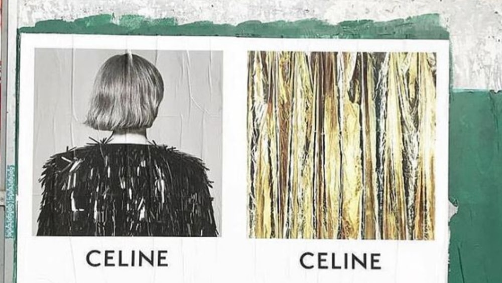
High fashion giant Céline has dropped “É” as it has now re-branded itself as ‘Celine’ under the newly appointed Artistic, Image and Creative Director, Hedi Slimane.
This is indeed a move made to pay homage to its historical roots as the French luxury fashion mecca was originally Celine in the 1960s. The new logo is designed the same way but with a slight spin of modernist typography from the 1930s.
In detail, the change is not that big as the accent on “E” has been removed and the spaces are now tightened in between the letters. As per the brand’s Instagram account, the new logo creates a “simplified and more balanced proportion.”
This was not the only thing new on the account as it has been completely cleared off all the images and creative graphics that were posted under the directorship of Phoebe Philo, the Creative Director who preceded Slimane. Only three posts remain on the account that are present to announce the new look of the brand. The posts also suggest the reinstating of “Paris” that will be visible with the clothes and packaging but not below the logo.
Hedi Slimane is reputed for taking such radical measures to rebrand the labels to “restore the brand” as he changed Yves Saint Laurent to Saint Laurent in 2012, along with its logo and graphic design. Saint Lauren also followed suit as all of their posts from Slimane’s time were deleted when Anthony Vaccarello took over as the director.
The rebranding of such a luxury brand is reminiscent of the recent trend the high fashion hub is following of changing the brand’s image with the changes in the leadership. Not a long time back, Riccardo Tisci also changed the logo and brand monogram for Burberry while reaching back to the label’s roots (the monogram included interlocked “TB”, a homage to Thomas Burberry).


